Reference
Title: Communicating Software Agreement Content Using Narrative Pictograms
Author: Matthew Kay and Michael Terry
Summary
This article is a presentation of "narrative pictograms", referred to by the authors as "illustractive diagrams designed to convery the abstract concepts of software agreements. For the most part, this refers to EULAs presented to users when they install software as a way to more easily convey the terms of the agreement. These pictographs are explained as structured and standardized so that users always know what to look for. Furthermore the layout of these pictograms was the result of research by the same group, and is also included in the paper, along with the process and method of data collection.
Discussion
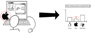
I found the article a bit hard to understand initially. While the goal of the article is to prove pictograms can accurately convey sensitive information such as the terms of EULAs, very few of the pictograms given as examples in the document intuitively made sense to me. They all required an explanation. For example, the pictogram I included above comes directly from the article. However, I doubt very many people reading this will understand what it means. According to the article, the Apple symbol on the left combined with the arrow and the rising bar graph is supposed to convey to the user that the program they are installing will collect data regarding what operating system the user is using. The fact that all of the provided pictograms required lengthy explanation was really counter-intuitive to the content of the article.
I think several of their pictograms are too busy in that they have too much useless information in the image. In the image provided above this includes all the shapes on the keyboard, the contents of the screen, and possibly the mouse. Later on in the article the authors go on to explain how these help them convey whether or not the user is using the computer when data is collected and so forth, but I think this could be shown in a much simpler manner. Use of the computer could simply be shown by having the stick figure place his hands on the keyboard. If you really want to demonstrate typing you can have a text bubble on the screen as well. By limiting the complexity of the image you draw the readers attention to what is truly important - which in this case is whether or not the user is using the computer and if information is being collected. We don't need to know that the user had paint open and was drawing a landscape and a house.
As a redeeming quality, I understand that if these pictograms became standardized they would of course become easier to read as people got used to them. However I still feel that there is no need to add elements that are not strictly necessary. The idea presented in this paper is good, but the way in which it is implemented and delivered needs some work.

No comments:
Post a Comment